Digital Transformation | June 2026

For the first two decades of enterprise analytics, dashboards were built by IT. Business users specified requirements; developers translated those requirements into queries, reports, and visualisations; IT tested and deployed; and a finished artefact was delivered weeks later. The backlog was permanent, the cycle was slow, and the result was a persistent gap between what business users needed and what they received.
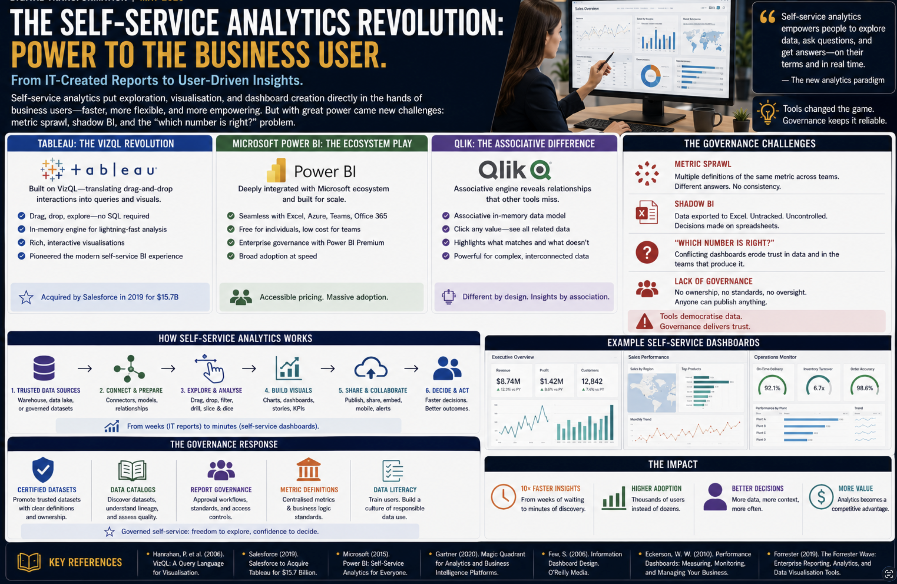
The self-service analytics revolution changed this dynamic fundamentally putting the tools for data exploration, visualisation, and dashboard creation directly in the hands of business users. It was powered by a new generation of BI tools with drag-and-drop interfaces, in-memory engines, and pricing models that made licensing accessible to entire organisations rather than just specialist teams. The change was transformative. The problems it created were equally significant.

Tableau: The VizQL Revolution
Tableau Software, founded in 2003 as a spinout from Stanford University, was built on a piece of technology called VizQL (Visual Query Language) a system that translated drag-and-drop interactions with a visual interface into database queries, rendering the results as interactive charts automatically. The user selected fields from a data source, dragged them onto “rows” and “columns” shelves, and VizQL determined the appropriate query, executed it, and rendered the result with no SQL, no coding, and no IT involvement.
The impact on adoption was immediate. Business analysts who had been limited to static reports or Excel pivots could now build interactive dashboards in hours. Tableau’s in-memory engine (the VizQL engine caching extracts of the underlying data) delivered query performance that felt instantaneous a key factor in the exploratory, iterative workflow that self-service analytics enabled. A user could filter, drill down, and cross-filter a dashboard containing millions of records in seconds, adjusting their analysis in real time as they developed their understanding.
Tableau grew from a startup to a company with over $1 billion in revenue and was acquired by Salesforce in 2019 for $15.7 billion, at the time one of the largest software acquisitions in history. The acquisition reflected the recognition that data visualisation had become a core enterprise capability rather than a specialised tool.
Microsoft Power BI: The Ecosystem Play
Microsoft Power BI, launched in 2013 and made generally available in 2015, took a different approach to market: rather than competing on technical novelty, it competed on ecosystem integration and pricing. Power BI was tightly integrated with Azure (Microsoft’s cloud platform), Office 365 (particularly Excel and Teams), and the Microsoft data stack (SQL Server, Azure Synapse, Azure Data Lake). Organisations already running Microsoft infrastructure found Power BI the path of least resistance data already in SQL Server or Excel could be connected and visualised with minimal configuration.
Power BI’s pricing model free for individual use, low-cost subscription for team sharing, premium for enterprise governance features dramatically undercut Tableau and MicroStrategy. A small team could start using Power BI at no cost and scale up as adoption grew. This aggressive pricing made Power BI the dominant self-service BI tool by user count within a few years of its launch, even as Tableau maintained a reputation for superior visualisation capability and analytical depth.
Qlik: The Associative Model
Qlik (founded 1993, originally as QlikTech) differentiated through its associative data model an in-memory engine that preloaded all data and maintained the associations between all fields, enabling users to click any value in any chart and see the entire dashboard filter to show only data associated with that selection. This associative filtering was genuinely different from the SQL-filter model used by Tableau and Power BI: it showed not just what matched a selection but highlighted what did not match, revealing data relationships that filter-based tools obscured.
QlikSense (the successor to QlikView, launched 2014) brought the associative model to a modern self-service interface and remains a significant enterprise analytics platform, particularly in manufacturing, retail, and process industries where operational data relationships are complex.

The Governance Problems: Metric Sprawl and Shadow BI
The democratisation of analytics created a governance crisis. When anyone could build a dashboard, everyone did and no two dashboards agreed on the numbers.
Metric sprawl: five different teams built five different “customer count” dashboards, each with a slightly different filter (do we count churned customers? trial accounts? accounts with zero transactions?). When the CFO asked for the customer count in the board meeting, the answer depended on which dashboard you looked at. The five teams had each built something that was correct by their own definition but the definitions were inconsistent, undocumented, and uncoordinated.
Shadow BI: business users who found self-service tools too complex or too limited downloaded data into Excel and built their own analysis pipelines. These spreadsheets circulated by email, were modified without version control, and became the basis for decisions without any connection to the governed data infrastructure. The self-service tools had been introduced to replace Excel; in practice, they added a layer above Excel without eliminating it.
The “which number is right?” problem: when the finance team’s Power BI dashboard showed a different revenue figure than the sales team’s Tableau dashboard, trust in both collapsed. Business leaders learned to cross-check every figure against a spreadsheet before presenting it. The overhead of reconciliation consumed the analytical capacity that the tools were supposed to free up.
The Governance Response
Organisations responded to metric sprawl with a combination of governance programmes and technical controls. Certified datasets data sources endorsed by the data team as reliable and correctly defined were marked in BI tools so that users could distinguish trusted sources from ad-hoc extracts. Data catalogues provided searchable inventories of available datasets with definitions, owners, and quality indicators. Report governance frameworks established approval processes for dashboards published to senior leadership.
These governance measures helped but they were fundamentally reactive. The metric inconsistency problem required a technical solution: a single place where metric definitions were codified and enforced for all consumers. That solution the semantic layer and metrics store would emerge as a distinct architectural component, described in Part 14.
References
- Hanrahan, P. et al. (2006). VizQL: A Query Language for Visualisation. IEEE Symposium on Visual Analytics Science and Technology.
- Gartner Research (2020). Magic Quadrant for Analytics and Business Intelligence Platforms.
- Salesforce (2019). Salesforce to Acquire Tableau for $15.7 Billion. Press Release.
- Microsoft Corporation (2015). Power BI: Self-Service Analytics for Everyone. Microsoft Blog.
- Few, S. (2006). Information Dashboard Design. O’Reilly Media.
- Eckerson, W. W. (2010). Performance Dashboards: Measuring, Monitoring, and Managing Your Business, 2nd ed. Wiley.
- Forrester Research (2019). The Forrester Wave: Enterprise Reporting, Analytics, and Data Visualisation Tools.